Thursday, October 6, 2011

Steve Jobs - The Passing of an Artist


"Art is high-quality endeavor."
-From Zen and the Art of Motorcycle Maintenance


I am saddened by the passing of Steve Jobs.
I grew up using Apple products and eventually became interested in the soul behind the company - especially it’s rebirth upon Steve Jobs' return in the late 90‘s.  It seems that Apple’s success stems from a focus on quality - and I imagine that this is in no small part due to Steve Jobs.  Quality vision, quality business management, quality products, and quality marketing.  
I also think that Apple’s success reminds us of the importance of visual elegance.  Apple’s user interface and product design have always been a joy to work with - in fact, even unpacking an Apple product is blissfully aesthetic.  And Steve Jobs had his hand in much, if not all, of that - he brought us fonts on our computers and personally holds packaging patents (along with over 300 other design and operational patents).  He cared about design. . . In one instance a completely superfluous screw was installed in a computer’s case so that it balanced with the other side of the machine.  And not only did the outside and inside hardware have to look good, but the actual computer code did too.  On and on it goes.  So does Apple place form over function?  No, anyone who has used one of their beautiful products has to concur with Steve . . . “it just works.”  He also cared about details . . . it has been said that he would obsess over the getting the right color of green to be used in a keynote presentation slide and at times he, the CEO, determined the curve of the bevel on the corner of a computer.  
Yet while he was very detail oriented, he also excelled in opening our minds to grand possibilities. 


Every time he spoke there was a positive energy about some sort of growth.  He made things happen.  Even his failed company NEXT became the underpinnings of Apple’s highly praised UNIX based OS.  

His management style was very creative - perhaps a bit harsh from stories of those close to him - but was focused on quality.  I’ve read many articles about Apple’s methods and find them very focused and designed to produce quality - such as the method of developing a product with all teams on board and the number of initial concept designs required and the number of prototypes created.  It seems that Steve was never afraid to sacrifice something good in order to achieve the best - such as the late-hour complete redesign he engineered of the Apple brick and mortar store model that has proved successful beyond anyone’s expectations.
I guess that’s why I’m sad - we’ve lost a visionary who cared about quality and was in a position of influence.  His influence has been felt around the world and is so noticeable because so many of Apple’s products are communication tools.
I don’t believe life ends at death - I believe that we each stay who we are as we move into another sphere of existence.  Products get old (who cares about the 1st generation iPod anymore), but talents, relationship and management skills, values, discipline, work ethic, knowledge, experience and one’s character, among other things, do go with us into the next life - and even as I hope Steve is productively engaged even now - I know that here we miss him.
I’ve written this on a Mac, by the way.


Apple.com Homepage Oct. 5, 2011

Friday, July 15, 2011

Good Advice


Looking Through • 18" x 36" • Oil on Linen on Panel


Available information wisely used is far more valuable than multiplied information allowed to lie fallow.
- Dallin H. Oaks


The above quote makes me think about the following pattern - which seems to be a recipe for sanity in this age of information.
  
Look • Learn • Ponder • Apply

LOOK for the information you need until you find it.

LEARN from the best sources possible.

PONDER what you learn.

APPLY the new insights gained.


Thursday, June 16, 2011

Number 9

And finally . . . number 9, the final painting of the Elements and Principles series.  (The July/August issue of The Artist's Magazine is available here.)


Wednesday, June 15, 2011

Number 8

This painting does feature yellow paint straight from the tube, but alas, no, chroma, is not the principle illustrated.

Monday, June 13, 2011

The Seventh Painting

There are officially four principles being shown by "Art" in this painting.

Sunday, June 12, 2011

The Sixth Painting

Here's a close-up of this background . . .  (Another very difficult painting to photograph.)


Friday, June 10, 2011

Painting Number 5

Here's the fifth painting of the series.  And here are some "making of" shots.

Tuesday, May 31, 2011

Painting Number 4

A little behind the scenes note on this painting, it is a REALLY hard painting to photograph.  I used pure white for the background - (click here if you'd like to see a close-up of the white impasto on my facebook page) and when the image is exposed for pure white the color fades away.  This isn't the best reproduction of it, but there will be a better reproduction of it on my website in early June.  Just a note - this painting was painted using only three colors, plus black and white.   Can anyone guess which colors - here's a hint, they're made by Lukas. . .


Monday, May 23, 2011

Painting Number 3

Here is the 3rd painting - and yes, there is a purpose to the order.  (Title Hint: the painting may illustrate more than one element or principle. . .)

Friday, May 20, 2011

Painting Number 2

There will be an online link to the steps used to create this painting in the Artist's Magazine article next month.

Tuesday, May 17, 2011

A New Series of Paintings

In a couple of weeks the next edition of The Artist's Magazine will include a series of paintings I did.  The theme of the paintings is "The Fundamental Elements and Principles of Design."  Elements of design are the building blocks of any visual imagery.  The successful use, and combination, of these elements will display certain principles of design.  In these paintings there is a central figure who represents "art".  She illustrates each element and principle of design in each painting.

I'll post these images until the release of the magazine. . . without titles.  See if you can guess what element or principle the painting is describing.  The first one is pretty easy. . .


Friday, April 1, 2011

Michael - Final Step


"Michael" • 12" x 16" • Oil on Panel


Some notes about the final layers:  Sometimes I like to paint final layers after oiling-in the surface of the painting - this allows me to see the real values of the dried paint and also "melts" the brush strokes into the painting.  At this stage I added a few directional strokes to the background - to liven up the surface.  I also painted the hair, added the highlights on the front of the sweater and signed it.  The hardest part was probably painting the tromp l'oeil frame around the painting at the end.  (just kidding. . . . . it wasn't that hard - -just kidding, that frame is real.) 

Wednesday, March 30, 2011

Michael - Step 7


The jagged strip of white on the sleeve in step 5 wasn't terribly descriptive, so I added more light strokes to indicate the turn of the sleeve.  I also painted in more of the dark sweater over the initial tone in back of the arm and brought it around the front of the shoulder/sleeve.  The background needed a smidge of softening around the face - so that ancillary contrast didn't distract from the face.

Up Next - Completion

Monday, March 28, 2011

Michael - Step 6


Refinements . . .. Some edges needed softening - like on the forehead - while some needed sharpening or changing - such as around the eyes and mouth.  The missing nostril wandered back into place and some additional cool highlights were added to the background.

Up Next . . . The shirt and sweater.

Tuesday, March 15, 2011

Michael - Step 5


At this stage I pull out a smaller brush and begin refining the features - following the "general to specific" pattern.  It's helpful if the edges aren't really hard at this stage so that I can choose which edges will be hard at a future stage of refinement (it's usually easier for me to paint a hard edge than a soft edge).

Next Up. . . Refining the broader areas (and the missing nostril).


Saturday, March 12, 2011

Michael - Step 4


After putting in the darks and some lights, it's the midtones' turn - again, going from dark to light.

Next up . . . Refinements

Friday, March 4, 2011

Michael - Step 3


I generally follow two simple rules when painting in oils:

Dark to Light
and
Back to Front

Basically, I've found that when I'm modeling a form it works out best to paint the darks first and then add the lights.  It just doesn't work as well going the other way.  This does not apply when I'm not modeling form - such as the silhouette of a dark tree branch in front of a bright cloud.  In fact, this is a good illustration of my other rule - back to front.  It is generally better to paint things that are behind other things first.  It helps with edge quality - plus, think how hard it would be to paint a tree and then try to paint a cloud peaking through each tree branch (although I do know of an artist that does this!)  Now back to the first rule - if the branches were one color but the trunk needed modeling, I would add the lights to the dark of the trunk, I wouldn't paint the trunk light and then try to paint the shadow.

In this step 3 of "Michael", I've started putting in the darks.

Up Next - Going towards the light - filling out the midtones.

Monday, February 28, 2011

Michael - Step 2


Filling the Canvas and Avoiding Surprises.

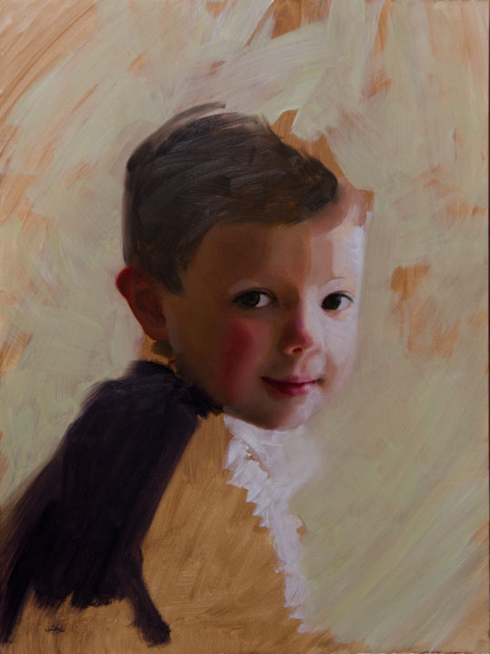
After getting the features in place, the next step here was to establish basic local colors.  Since the appearance of a color is affected by the colors around it, I wanted to fill the canvas with the basic big colors - in this case, the brown of the shadow of the face, and the light green of the background (actually you might call it a seafoam green, if you look at it under the right light bulbs).

Up Next. . . Dark to Light

Tuesday, February 22, 2011

Michael - Step 1

There are many ways to paint a painting, so it's important to know what characteristics you want your finished painting to have.  When I'm clear about what I want for a certain painting, then the process to get there becomes a bit clearer.  In this case, I wanted to paint a solid painting of Michael - large masses and not much transparency.  


Michael - Step 1 • 12" x 16" • Oil on Panel

Step 1 - Tone, Anchor and Range

TONE - Unless I'm doing a transparent painting, I usually tone the surface of the painting to get rid of the white.  In this case, I wanted a little texture since I thought that there might be some part of the background that would show through - however, I didn't want too much texture in the face since I wanted the planes to be fairly large masses.  Why tan?  So the face could be built up on analogous colors.

ANCHOR - There are billions of humans on the earth and word is that we all look different.  I am taking this on faith since I haven't checked everyone . . . though some research indicates that there are certain people who look like each other.  In any event, most all of us have two eyes, two ears, one mouth and one nose.  The reason we all look different is that each individual's features and the distances between them are slightly unique.  When you paint a portrait, it is usually implied that you obtain a likeness of the subject, requiring accurate depiction and location of that individual's features on your painting.  I've found that I can do this best by establishing a point of reference against which I measure the other features.  I call this my anchor and I generally use an eye.  The reason for this is that the eye contains several points (like the tear duct) and distinct contrasts (like the iris against the white of the eyes).  The mouth moves too much and the nostrils are usually too small.  You can see in this image of Step 1 that I'll often paint vertical or horizontal guidelines to help me line up the other features of the face according to the anchor point.

RANGE - Once the features are in place, I need to establish my value range.  I'll try to find the large value masses and indicate these roughly.  I also indicate the darkest darks and the lightest lights of the painting, then I know that the other values must fall between these parameters.


 . . . Next up - Filling the canvas - no surprises.

Wednesday, February 16, 2011

The Face


Heather • 8 1/2" x 11" • Graphite on Paper

On Tuesday nights I teach an art class called Theory & Practice.  Each session has two parts, a few weeks of theory and discussion about a particular topic and a few weeks of painting and/or drawing anything the student wants.  Last night, I did this little linear graphite demo of our model Heather.  This session has been a lot of fun - it is a very talented and congenial group.

In two weeks we'll start the next session which will be devoted to the face.

For more info, click here.